Tuesday, 18 June 2013

Fashion and Textile Materials Understanding Subject

In this subject, I had done a few projects such as making an experimental garment using different material than fabric, vacuum forming project, fabric bonding, and final garment. The my first project is using material that are pliable. In my case, I had chosen rubber band and inner tube of a car tires. I knot the orange rubber band with some gray rubber band. Sadly I didn't take any photo during the making of it. Below is the best 15  pictures of the garment during photo shoot session. I myself is the model and the photographer is my friend, Nabila. The poses is also constructed by her. 


I like this picture the most.


The second project is the vacuum forming project. In this project, we had to choose our own things to be put in the vacuum machine. The things I chose are a coca-cola glass, a golden lion head ring, some electrical appliances, Swiss army knife and nail clipper.


The final outcome
The hardest part is to remove the material out of the plastic form. The third project is fabric bonding. In this project, we just use fabric and double sided fusing.


Final project is the dress project. I used pliable material such as rubber to make a dress. And I sew it to make it attach to one another.


Thursday, 4 April 2013

Portfolio Book

I made my portfolio when in my foundation days for the subject Portfolio Preparation and the first task I received was I have to make my own portfolio book. I have to make it in my own style from the binding to the content of it. I chose these 3 color because it is the primary color, and it kinda give me the classic feel.

Picture 1 This is the cover of my book. 
I used laser cutting method to cut out the word and the star (with professional assist of course). The star actually is not a star, it is a laurel flower. The purple colored word is also cut out, and I used a purple jersey to cover it at the back. The reason I used purple jersey is because I make my first garment out of it (i'm a fashion student). There is smoke all over the box is because I need to make it look older that it age, so I choose smoke technique instead of burning cause burning makes it look not clean.

Picture 2 The side view of it.

Picture 3 The book. 
I used perfect binding to do the book. The star part is actually pop-up a bit. I used the left out part from laser cutting and wrap it with yellow colored paper.  

Picture 4 The back cover of the book (I called it, the box). 
The difference between the front cover is that the  color of my name is different. I used old denim (jeans) to cover the back of it. The other reason I used jeans is because one of my favorite lecturer is a fashion designer and his trademark is denim patchwork. So I do it to show that he is the foundation of my art world (he is my foundation lecturer) and to show my respect to him. 

Picture 5 Front view 

Picture 6 Side view of the book. 
I used yellow ribbon to cover to side of the book mainly because I make a mistake while cutting the book. But if i didn't mention the word "mistake" nobody will know it. It is one of my  way to make a mistake to a miracle. Always remember that don't always redo things when there is a mistake, you never know that mistake is your miracle. 

Picture 7 Behind the back cover.
A clean finish is a must whether you are an amateur or a pro.    

Picture 8 Behind the front cover.

Picture 9 First page, info of me.

Picture 10 Sketches

Picture 11 Mood board and sketches

Picture 12 Sketches

Picture 13 Sketches

Picture 14 Color

Picture 15 Color

Picture 16 Color and material

Picture 17 The making of and the final product

Picture 18 Final product


Thursday, 31 January 2013

Final: Compilation of everything

My brand called Luniqamo and I sell clothes that is in the category casual but have the street wear kind of feeling. Image 1 is my logo and i used gold color for it. 
Image 1

Image 2 is the positive and negative effect on my logo.
Image 2

In image 3 there is 2 type fonts for my business. Lobster 1.4 is the type font I used for my logo but I modified it a bit to make it into my own style. Arial is the type font that I used for other thing such as name card, member card and many more.
Image 3

Image 4 is the color that I used in my pattern.
Image 4

In image 5 is the pattern I designed and it have 2 version of it. Version 1 is without white outline and it look flat. Version 2 have the white outline and it have more tone. Thus, it look like 3D. 
Image 5

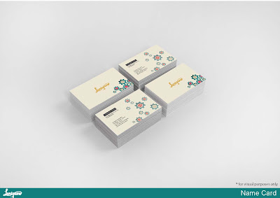
In image 6, is the my name card.
Image 6

Image 7

In image 8, is member card that also have 2 version. Version 1 is the dark version and the version 2 is the light version.
Image 8

Image 9
Image 10

Image 11


Image 12

Image 13

Image 14

Image 15

Image 16

Image 17

Image 18

Image 19

Image 20

Image 21

Image 22

Image 23

Image 24

Image 25

In image 26, is the application that I had created the layout. The idea of this apps is this apps can help u match some clothes or accessories. U just need to capture the clothes that u want match with and sent in to our database and it will look for you the suitable match. You also can directly buy for the apps. Like and share if you feel like to. ( People who used this apps normally is for planed event but lazy to go out and buy.)
Image 26