My brand called Luniqamo and I sell clothes that is in the category casual but have the street wear kind of feeling. Image 1 is my logo and i used gold color for it.
Image 1
Image 2 is the positive and negative effect on my logo.
Image 2
In image 3 there is 2 type fonts for my business. Lobster 1.4 is the type font I used for my logo but I modified it a bit to make it into my own style. Arial is the type font that I used for other thing such as name card, member card and many more.
Image 3
Image 4 is the color that I used in my pattern.
Image 4
In image 5 is the pattern I designed and it have 2 version of it. Version 1 is without white outline and it look flat. Version 2 have the white outline and it have more tone. Thus, it look like 3D.
Image 5
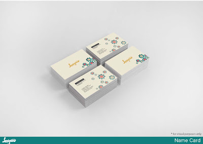
In image 6, is the my name card.
Image 6
Image 7
In image 8, is member card that also have 2 version. Version 1 is the dark version and the version 2 is the light version.
Image 8
Image 9
Image 10
Image 11
Image 12
Image 13
Image 14
Image 15
Image 16
Image 17
Image 18
Image 19
Image 20
Image 21
Image 22
Image 23
Image 24
Image 25
In image 26, is the application that I had created the layout. The idea of this apps is this apps can help u match some clothes or accessories. U just need to capture the clothes that u want match with and sent in to our database and it will look for you the suitable match. You also can directly buy for the apps. Like and share if you feel like to. ( People who used this apps normally is for planed event but lazy to go out and buy.)
Image 26


